
The Interactive Discovery
Experience
Amazon.com Music Store

You shop for CDs, DVDs and vinyl?
Amazon.com is the go-to place on Internet for anyone looking for physical music, serving customers with huge selections, unbeatable low prices and superb service. Music, along with other media categories, has always been one of the top categories at Amazon.
However, the way people shop for physical music is dramatically impacted by the booming of digital content. It had been long since the launch of Music store, and it was time to make change.

The Problem
What’s trending?
Your expectation. Many people listen to what others like. The bandwagon effect is human nature. You follow the trend, and look for top-selling tracks. You can’t wait to try the new releases.
Amazon. They're hidden somewhere on Amazon store, which is usually more than 10,000 pixels long.
What do you like?
Your expectation. Finding the right music becomes more of a personalized experience. You still listens to top songs, but you do not just walk in a store and pick the albums on display. You explore new albums, and find the ones you like.
Amazon. You get 3 or 4 recommendations based on your purchase history on Amazon. But that’s the end of experience. If you don’t like it, you aren’t getting anything else. Go shop “What’s hot in each genre".
What are those... ads?
Your expectation. There are more tracks released each day and more genres available than before. To get your attention, companies advertise in the store. Sometimes, the editors also share their favorite list with you to help you make decisions.
Amazon. You get graphics with different visual treatments, sometimes some text with a blurred album cover. There are too many, too busy to fit on the page. You choose to ignore it.
Why does the store looks like… 10 years ago?
Your expectation. You enjoy the browsing experience on iTunes, even if it sometimes couldn’t find what you’re looking for. You like the pixel-level refined look & feel.
Amazon. Bold color contrast, mixed typography, weird paddings. You think Amazon looks more like a old-style mail order catalog.
Challenges and Key Considerations
I took this project, and decided to do more than the layout changes. There are a few key considerations (as well as limitations):
Better visual processing
Customers do not spend on a page reading every detail - they scan it quickly. I must understand their need, and present information with simple structure and clear hierarchy.
Leverage personalization
Amazon boasts of its recommendation system. The resource is here, what I need to design is a user-friendly interface to assist users in finding their music.
Room for merchandising
Amazon is a retailer, not a manufacture. Presenting campaigns from vendors is still one of the priorities. I must find the right strategy to balance between merchandising campaigns and product information.
It’s still Amazon
People don’t shop on Amazon Music store. People shop on Amazon. As creative as I want to be, I must conform to the UI consistency to some extent, so it’s not detached from the ecosystem.
The Refreshed Storefront
Clear layout.
Standard left navigation. There’s no need to introduce a new navigation structure, because this is part of Amazon. Keep it consistent so customers know where they are. .
Sidebar removed. It’s not just because it makes the page look busy. Data shows that the click rates on right sidebar are unbelievably low. It probably overwhelms customers.
Redefine slideshow. People love and hate slideshows. It looks beautiful, but often performs badly. I challenge this idea, and designed a new format for slideshow (see detail here).
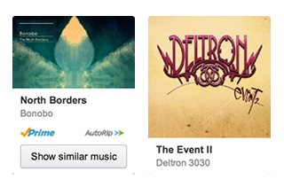
Redesigned widgets. Best-sellers, New releases has a fresh look with legible text and compelling visual treatments. It’s easier to find what you’re looking for.
Powerful personalization.
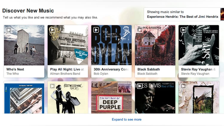
Discover New Music is at the core of this redesign. It offers a fun and compelling way for customers to explore and discover the music they like. Unlike the traditional product slider or static recommendations where customers are passively receiving recommendations, this design allows customers to tell Amazon what they like, and Amazon then returns related recommendations.
See it live here or watch the demo below.
Merchandising blends in.
Customers ignore merchandising campaigns, because they are visually different and irrelevant, like outliers. This design blends the campaigns into the browsing experience rather than letting it stand out. For example, “New releases” contains machine-generated upcoming releases as well as opt-in features albums.
Performance data
- Detail forthcoming.
My roles
- Concept design
- Communication with business
- Interaction design
- Production front-end code (HTML/CSS/JavaScript)
- Client support